.png)


Live site: Adcetera
The Problem
Adcetera’s website lacked clear service positioning, had a confusing navigation structure, and was difficult to update, leading to missed client opportunities and conversions.
When I joined Adcetera, I noticed the website lacked clear service positioning, making it hard for clients to navigate—evidenced by the sitemap being one of the top 10 most visited pages. Updating content required developers, slowing changes and increasing costs, while hidden content hurt SEO and visibility.
the opportunity?
To improve internal efficiency and empower non-developers to manage content, we have the opportunity to move to Webflow, simplify the website's structure, and better highlight our core services to drive increased engagement and conversions.
Role
Research, UX/UI, Design Strategy
Timeline
Nov 2024 - Dec 2024
Tools used
Figma, Webflow, Jira, Confluence
Snippets of the process
If you want to learn more about the project, feel free to reach out to me to share more!

Clarifying Positioning & Nav
High sitemap traffic revealed navigation issues. Core services were buried, making them hard to find. I proposed categorization options, guiding executives to a streamlined structure that improved usability.
.png)
Moving to webflow
Migrating to Webflow empowered non-developers to update content easily, improving agility and SEO through strategy driving the website.

Partner Page Optimization
Partner pages drew high traffic but had high drop-offs. We restructured them to showcase expertise, boost credibility, and improve conversions, aiming to turn traffic into leads.
what we wanted our users to understand, feel and do
Understand
We wanted the website to make it clear who Adcetera is and what services we offer—no confusion, just straight to the point.
Feel
We wanted users to feel 'wowed' and impressed of Adcetera’s work, and feel that we're up to date with evolving tech.
Do
Our goal was conversions and validation for users coming from outbound email compaigns.
Deliverable: the Website
We delivered a redesigned website in Webflow with a clearer service structure, easier navigation, and a fully responsive layout. This made it simple for the internal team to update content, improve SEO, and helped boost engagement and conversions.


the case studies
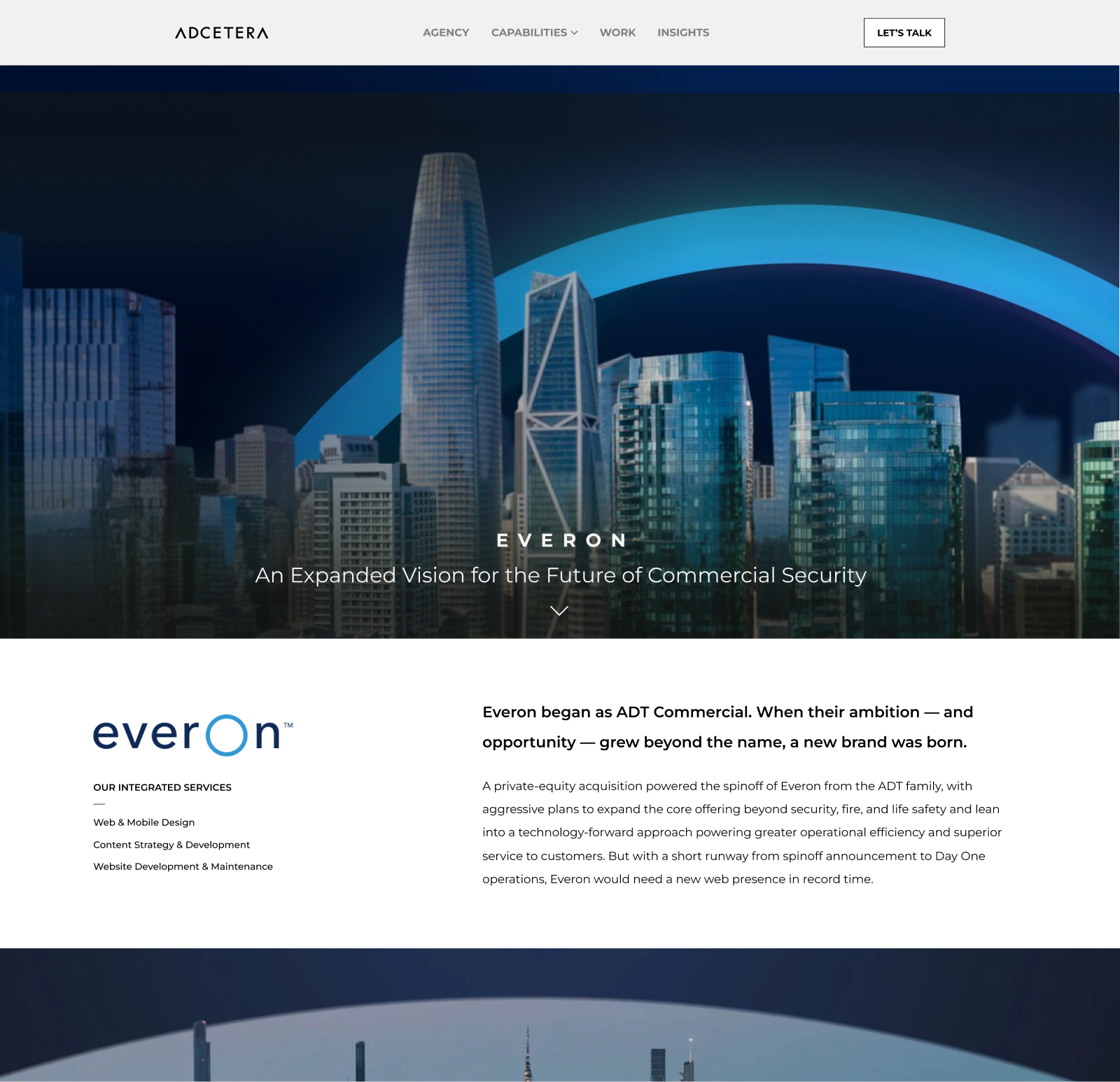
Case studies served as key validators and drove traffic, but lacked consistency. I devised a structured narrative, pitched it to executives, and secured immediate approval.
.jpg)


Mobile responsitivty
Our previous site had several components that weren’t responsive across multiple breakpoints, so ensuring flexibility across all devices became a core focus. By prioritizing this, we created a seamless experience on mobile, tablet, and desktop.


.jpg)


Thanks for reading!
Contact me via email or linkedin to learn more.
.png)
